Our topic at the SFF Seven this week is “Judging a book by its cover: cover trends and what you look for as an author or a reader.”
There have been excellent posts this week exploring why we buy covers, what we look for and love in covers, even being misled by covers. What I’m going to talk about is what a cover ISN’T for an author. And yes, this is something that’s hard to hear. Stop now if you’re not ready for a little tough love.
What a cover isn’t: It is not an expression of the author’s creativity.
I say this because I’ve heard more than one – usually a newer author – say that they want it to be. I recall one time that my aunt asked me to talk to a friend of hers who was a first-time author working with a small press to publish her memoir. She was super unhappy with the cover they developed and fighting with them about it. I think she fully expected me to give her ammunition in that fight. Instead, I gave her this tough love talk:
The cover of the book is not an expression of your creativity. The BOOK – what’s inside the front and back cover – is the expression of your creativity. You got all those words and pages to convey the story you want to tell. The cover is not, and should not, be an extension of that story.
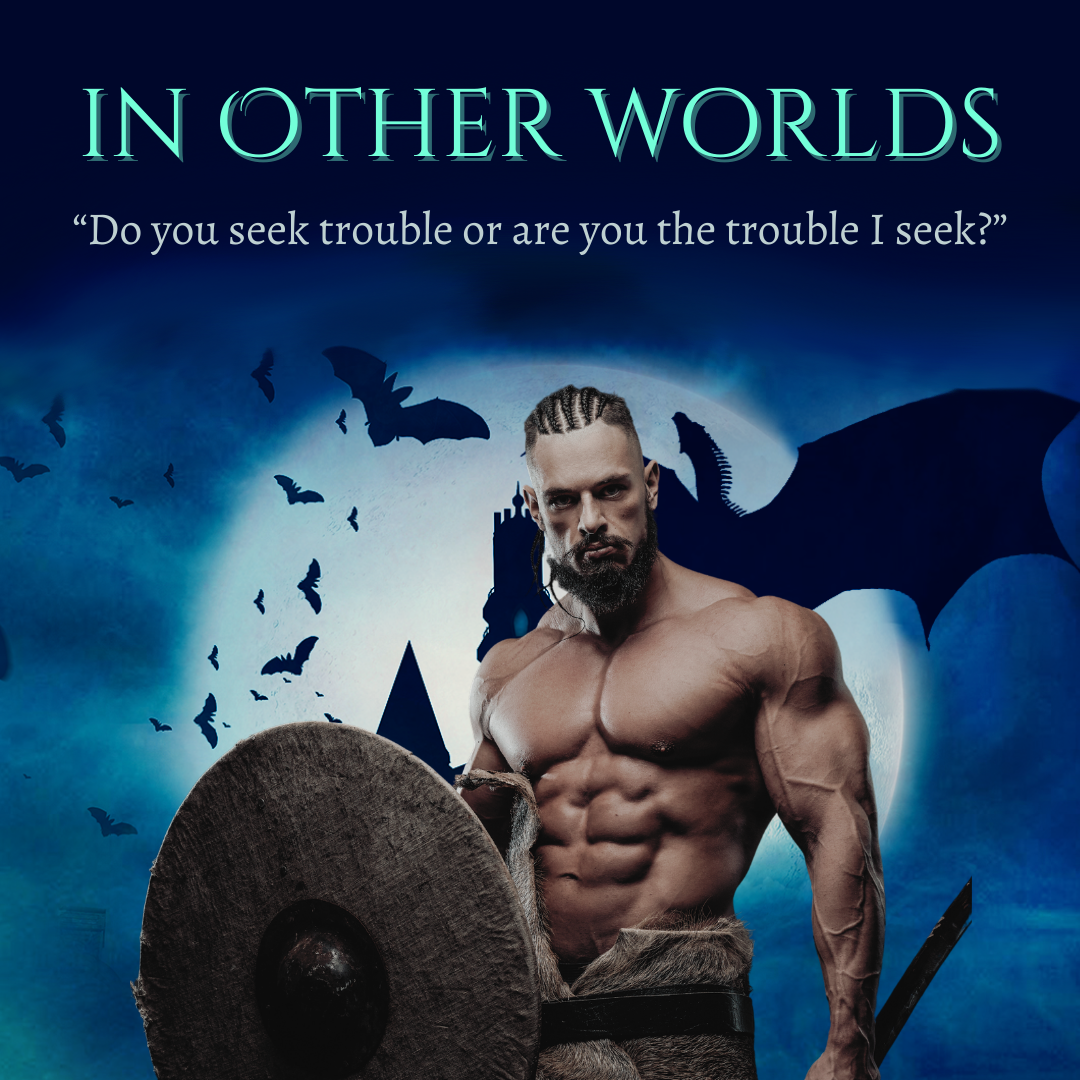
Now, I’m not saying that the cover CAN’T reflect the story, but a book cover has two jobs:
- Catch the reader’s eye in a pleasing, enticing way.
- Convey genre or some sense of what kind of story it will be.
That’s it. Simple, but also very difficult. That’s plenty of work for an image and a few words to do. Those jobs don’t need to be further complicated by putting the author’s story-vision into an image. In fact, when authors try to insert that vision, they can get in the way of the primary two functions of the cover.
So, I know it’s hard. I have been there and I have had covers I hated, where the characters looked NOTHING like what I had in my head. I have had covers I loved that did nothing to sell the story inside. I’ve had horrible covers that I’m convinced tanked sales. I’ve had covers that readers rhapsodized over for no reason that made sense to me. When I work with my cover designer on the covers of my indie books, I really have to take off my author hat and put on the publisher one – and remind myself of the two rules. Tough love for myself, too!
