
Beautiful new covers for my complete, six-book Sorcerous Moons series!!! The spine design with all six together is so gorgeous even Taylor is gasping in admiration! The print editions can be ordered via my website store or the usual retailers.




RITA ® Award-Winning Author of Fantasy Romance


Beautiful new covers for my complete, six-book Sorcerous Moons series!!! The spine design with all six together is so gorgeous even Taylor is gasping in admiration! The print editions can be ordered via my website store or the usual retailers.


Our topic at the SFF Seven this week is “Tick-Tock trends—have you tried any reading or writing trends?”
I’m leaving in the misspelling, just so you get how clueless we are. ~ Shakes cane at kids on lawn ~
Regarding TikTok – lol! – a social media property that originated in China, no, I don’t follow or attempt the trends. I sometimes feel like I should. I do have a TikTok account – https://www.tiktok.com/@jeffe_kennedy – and I even have over a thousand followers there, even though I almost never post anything. The followers are due to very kind and generous fellow authors who do the Tiks and Toks better than I do. (Shout out to Vela Roth and Lisette Marshall!)
So, I know that I really should post to TikTok, and I sometimes think about it, and even occasionally do it. But I also remind myself of advice I’ve been giving since the beginning of social media, which is that you “should” do only the kind you enjoy doing. Social media is social and if you’re hating it and faking being social and happy and fun, it shows.
Therefore, instead of discussing reader trends or writing trends or TikTok dances, I’m going to share these beautiful new covers for my complete, six-book Sorcerous Moons series!!! The spine design with all six together is so gorgeous even Taylor is gasping in admiration! The print editions can be ordered via my website store or the usual retailers.


How the patriarchy affects book covers, what about book covers makes books sell and other variables with a direct correlation. Also, revision and how I know when it’s time to stop drafting and start revising.


Our topic at the SFF Seven this week is “Judging a book by its cover: cover trends and what you look for as an author or a reader.”
There have been excellent posts this week exploring why we buy covers, what we look for and love in covers, even being misled by covers. What I’m going to talk about is what a cover ISN’T for an author. And yes, this is something that’s hard to hear. Stop now if you’re not ready for a little tough love.
What a cover isn’t: It is not an expression of the author’s creativity.
I say this because I’ve heard more than one – usually a newer author – say that they want it to be. I recall one time that my aunt asked me to talk to a friend of hers who was a first-time author working with a small press to publish her memoir. She was super unhappy with the cover they developed and fighting with them about it. I think she fully expected me to give her ammunition in that fight. Instead, I gave her this tough love talk:
The cover of the book is not an expression of your creativity. The BOOK – what’s inside the front and back cover – is the expression of your creativity. You got all those words and pages to convey the story you want to tell. The cover is not, and should not, be an extension of that story.
Now, I’m not saying that the cover CAN’T reflect the story, but a book cover has two jobs:
That’s it. Simple, but also very difficult. That’s plenty of work for an image and a few words to do. Those jobs don’t need to be further complicated by putting the author’s story-vision into an image. In fact, when authors try to insert that vision, they can get in the way of the primary two functions of the cover.
So, I know it’s hard. I have been there and I have had covers I hated, where the characters looked NOTHING like what I had in my head. I have had covers I loved that did nothing to sell the story inside. I’ve had horrible covers that I’m convinced tanked sales. I’ve had covers that readers rhapsodized over for no reason that made sense to me. When I work with my cover designer on the covers of my indie books, I really have to take off my author hat and put on the publisher one – and remind myself of the two rules. Tough love for myself, too!

A concern I have about a book cover designer who is offering discounts to authors who approve the use of AI-generated art. Also thoughts on training to improve wordcount and recognizing overdoing it.


 This week at the SFF Seven we’re discussing Cover Trends. We’re asking “What was, is, and will be “hot” in cover art/style for your sub-genre? If you have a say in your covers, will you chase the trend or will you stick with the image in your mind?”
These were among the first book covers I ever commissioned and I particularly adore the cover for book one, LONEN’S WAR. It does come straight from a scene in the book – a pivotal scene that was, in part, the genesis image for the story – and the artist (Louisa Gallie) exactly nailed what I had in mind.
I will always be grateful for Louisa’s gorgeous art and I will always love this cover.
But, recently, people have been pointing out that these covers no longer convey what kind of story these books tell. The fantasy romance genre has moved on. If I want to tell readers that this IS the kind of thing they’re looking for, then I should consider updating to match current trends.
So I did!
Behold: The new cover for LONEN’S WAR!
I contracted with BZN Studio Designs to design new covers for all six books. Right now the series isn’t available, but once I have all six covers, I’ll re-launch the series with some fanfare. I’m super excited to see how they do with the new covers. I’ve heard some people (including my own assistant!) say scathingly that these look like all the other covers out there in this subgenre, and there’s truth to that.
AND THAT’S THE POINT.
The content is what makes the stories unique. The covers are doing the job they’re supposed to do. Caught your eye, did it? I hope so! And I’m hoping you also know exactly what kind of story you’ll get.
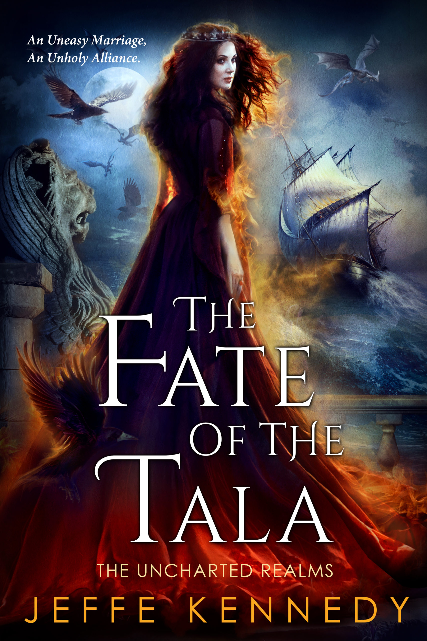
 Our assignment this week at the SFF Seven is to give a shout-out to the non-author creatives who enrich our lives: illustrators, musicians, jewelers, painters, poets, voice-actors, etc. This one is an easy pick for me because I just released THE FATE OF THE TALA, which means I’ve been posting the cover everywhere.
Fortunately, it’s so freaking gorgeous that no one gets tired of seeing it over and over. That’s because it’s the work of Ravven, Queen of the Cover Artists. Come on over to find out more.


So, no. This isn’t really a new release at all. It’s barely a new format. Coincidentally enough, our topic at the SFF Seven this week is marketing suckering readers into reading a genre they don’t enjoy. Come on over to read more!

