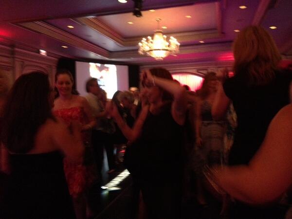
 That picture is a bit blurry, but that’s Nora Roberts rocking it out on the dance floor at the Harlequin party a the RWA National Conference. She is so wonderful in so many ways.
I’m over at Word Whores today, talking about why scenes should have goals.
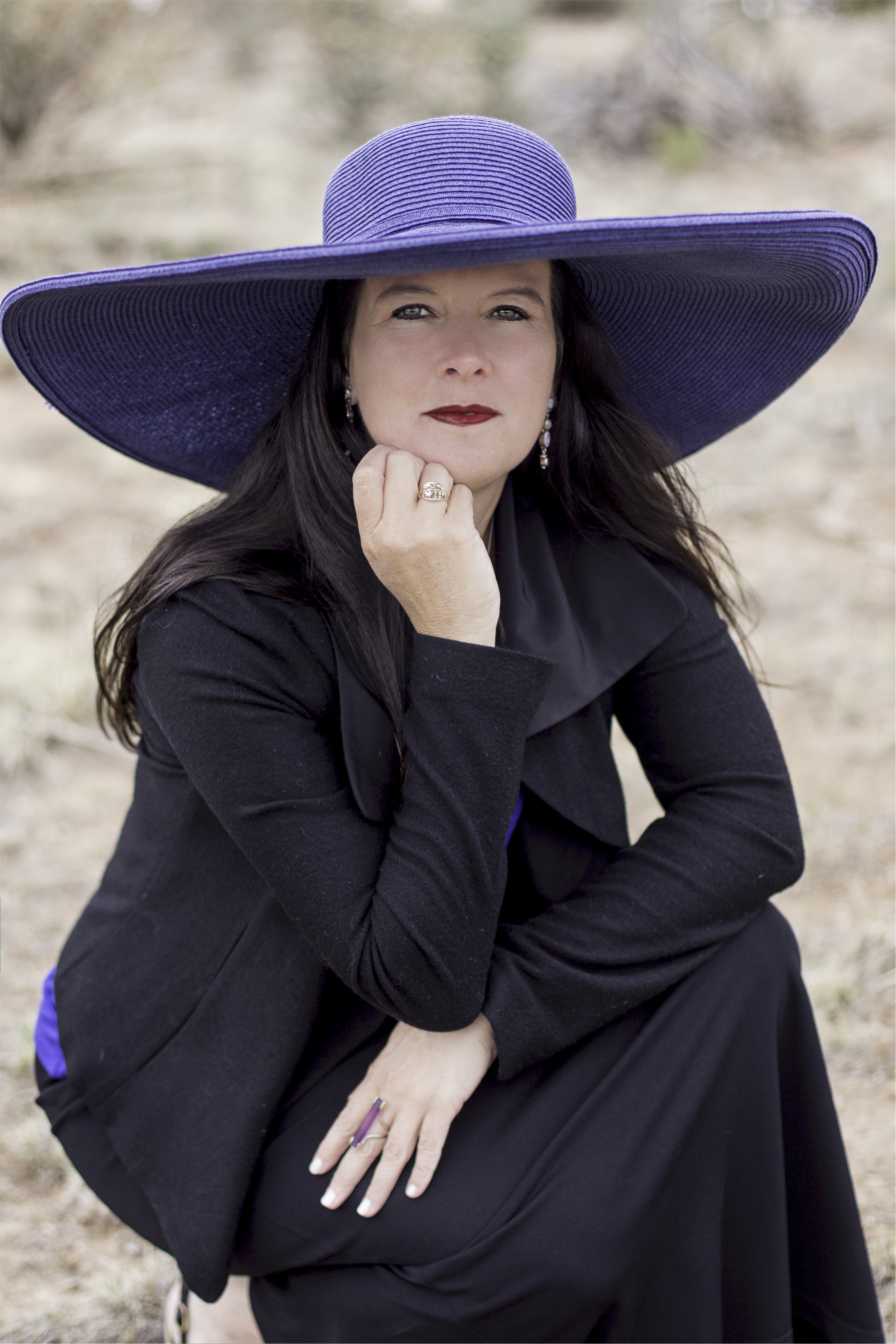
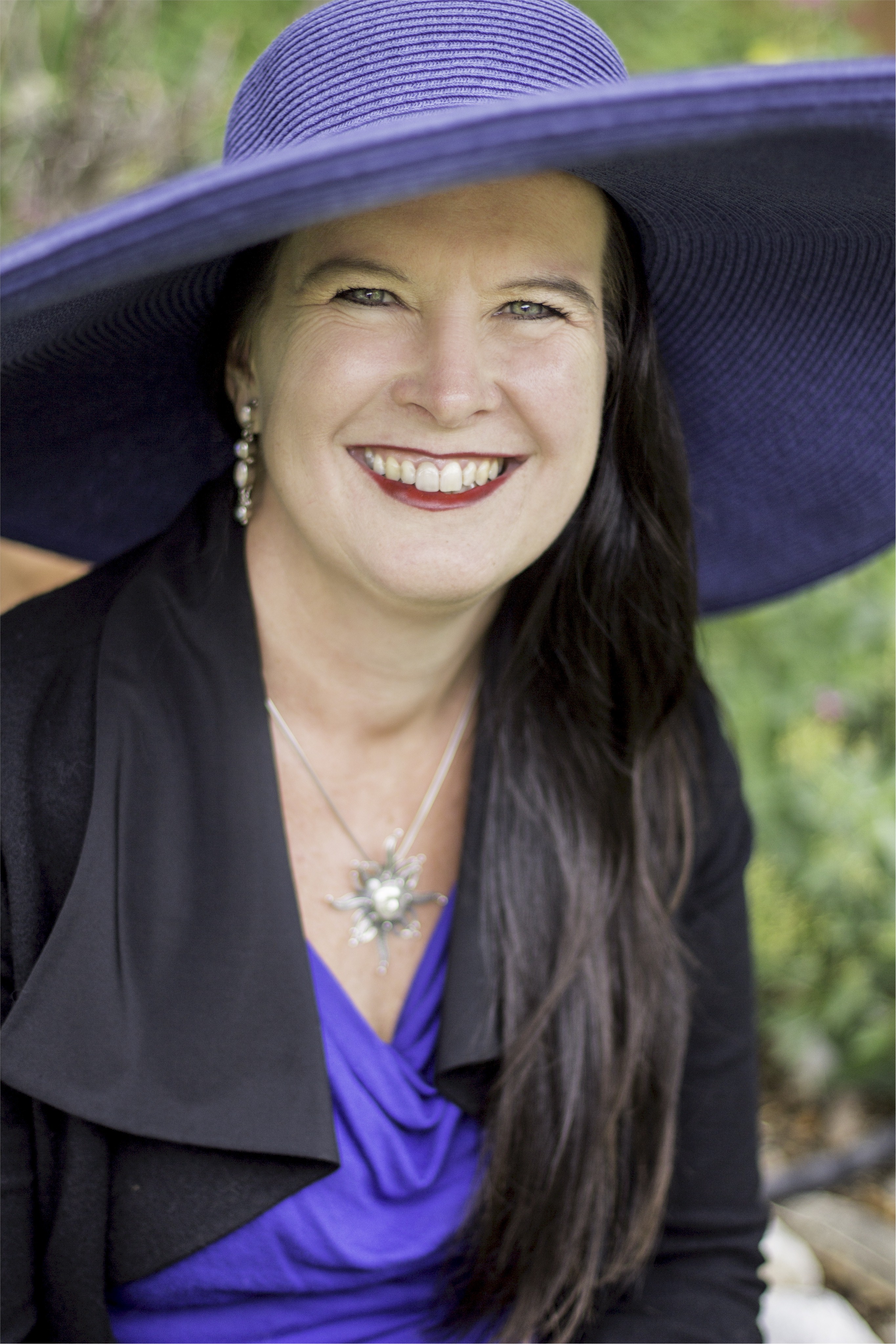
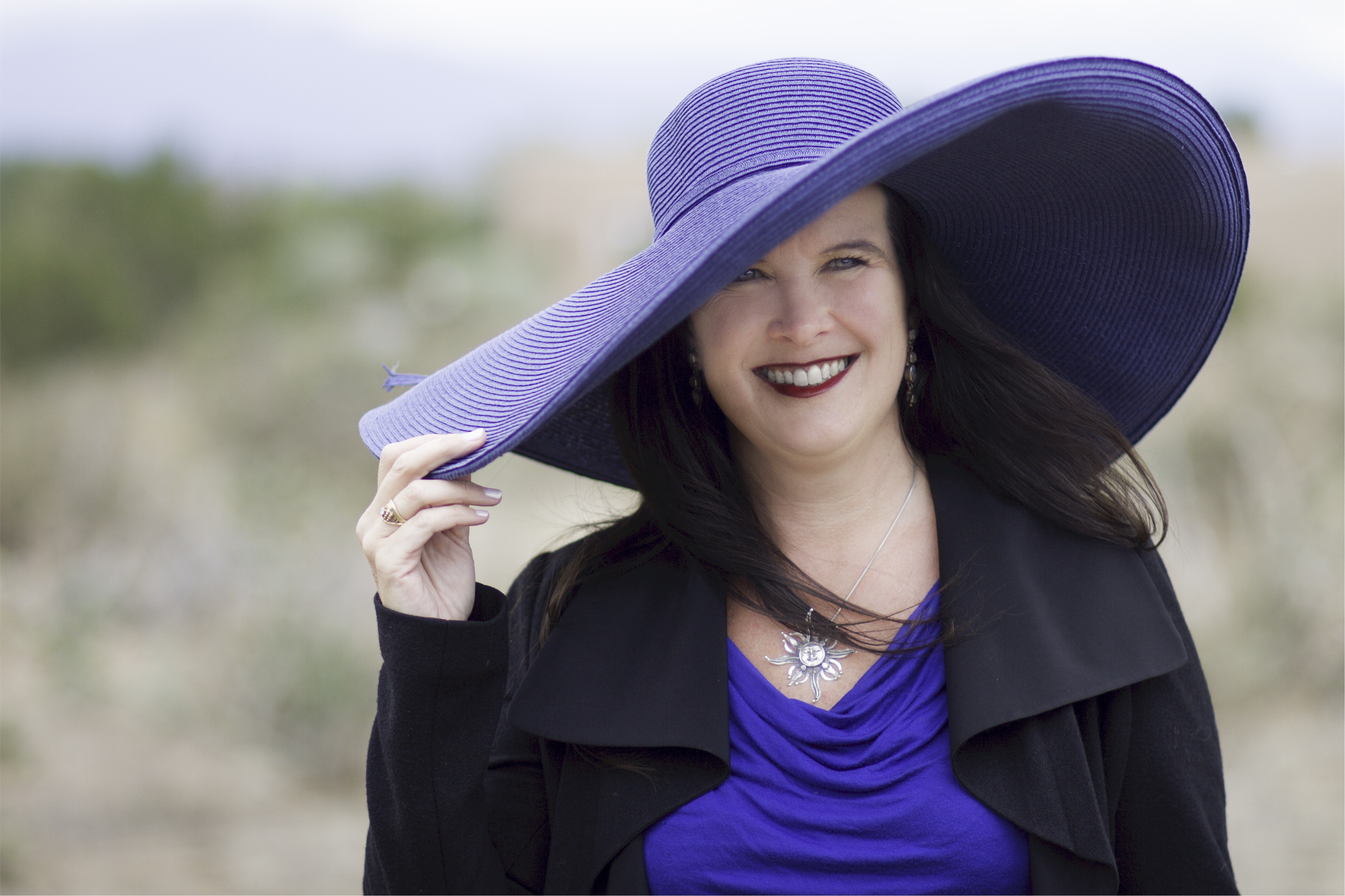
Also, I’m choosing a head shot for my book jacket! *muppet flail* A real book jacket!! So, I have four new shots. I’ll likely use the one I pick for all my social media schtuff, so you’ll be looking at it A LOT. Keep that in mind. Let me know which you like and why. I brought a SLEW of books back from the conference, so I’ll be giving away the book of choice to three commenters.
(As soon as my suitcases catch up to me, I’ll take a pic of the stack and you can choose from that.)
All pics taken by Sarah at Pritschow Photography. I think she did an amazing job.
(Also, for the purists, these are not the highest resolution I have – I reduced size for the multi-upload here.)
Take it away!
@jeffekennedy So hard to choose. Hmmm…
now you know why I had to do this!
My vote would be for either pic # 2 – or # 4 – With # 2 – You have a gorgeous smile & lovely eyes – and w/ # 4 – you see the entirety of the hat itself. (You always have the best hats~)
Thanks – I’m all blushy now!
@jeffekennedy number 2!
Thanks Shari! (I’ll keep you out of the book-win list.)
@jeffekennedy I love all of them but I think I’m partial to #2.
thanks for voting!
I like #4 the best, it has some personality to it and is a bit less typical as a head shot than the rest. Love the hat!
I like the “less typical” part, too. And thanks!
My favorite is #2 and hub’s favorite is #4.
Interesting that hubs liked #4!
Which photo do you think @jeffekennedy should use as her author photo on her book jacket? http://t.co/I0MdvycOaP
I like #2, pretty lady! They’re all great! =)
thanks!!!
@BookaliciousPam @jeffekennedy I like the 2nd one.
thanks for voting!
@kurzkeks @jeffekennedy yay me too!
I really like number two the best! All of them are very nice so it’s a hard choice.
I had a terrible time choosing, too!
I like the second one the best. =o)
thanks B.E.!
@BookaliciousPam @jeffekennedy I want to say the 1st one (you look intense & awesome), but in the 2nd you look friendly & open. #ProbBetter
there might be a use for intense and awesome, too…
As soon as I saw #2, I said, “That one” – and I hadn’t even seen #3 and #4 yet. Even then, #2 still won out.
LOL – you like what you like!
Number 2!
thanks for voting, Tina!
IMO, the close ups are better because of the size the photo will be on most things. I vote for #2.
Very good point, Rainy!
Second one down, Jeffe. Awesomesauce!
thanks Laurie!
The one with the hat.
ha ha
I vote number two! They are all amazing but the second is hands-down my favorite. You look so personable and engaging.
ooh, second use of “engaging” – I like that!
I say #2. It is the eyes, the smile and the jaunty hat angle in that order.
Love the term “jaunty” – thanks Jan!
#2. In actor headshots, once we narrow it down to the decent shots, we are taught to cover over the mouth and nose and just look at the eyes. Good luck!
ooh, interesting advice, Lesley!
2 or 4, but they all look great!
thanks Kaily!
Photo number 2. Definitely. #1 is too far away. # 3 you have squinty eyes. #4 is not your best shot. #2 IS, however, your best shot.
And yes, I am an amateur photographer who takes her actor husband’s headshots, why do you ask?
an excellent analysis, Christine – thanks!
#2 for me as well. You’re smile is just gorgeous in that one.
aw, thanks Carien!
#2 — and yeah, what gives, I know you’re my age, so why do you look a decade younger?
Clean living and a clear conscience, Tia! And thanks for the compliment!
I agree with the vast majority. #2, with the suggestion of the hat and the engaging smile works the best. The others are too far away and your eyes are not clearly visible.
you had me at “engaging”
gorgeous! but I vote for #2
thanks sweetie! ~flutters lashes~
I vote #2.
And compliments to Sarah.
hey – Sarah had good material!
LOVE #2. So you.
thanks MM! (I decided not to do it at RWA, after all, as you can see.)
Second one definitely – your eyes are so striking and the photo just says you have a wonderful story to share! (Altho the first one with the fabulous purple hat is great but not my first pick for an author photo.) HUGS!
aw, thank you Veronica! I’ll no doubt use that first one for something.
Absolutely # 2. It is a fabulous shot with just the right amount of blur everywhere except for your eyes. Kudos to your fabulous photographer Sarah who also adheres to the rule of thirds…by putting the main focus of attention NOT directly in the middle of the frame. The tilt of the hat and your head also adds a very nice element which draws you into the frame.
Kim – I just love that you gave it a critique – too funny!
love #2!
thanks!
Both Dave and I like #2. But I’m also drawn to #1. It’s not a look I see very oft
en of you.
It is a different one of me – I think I’ll use it for some things.
I like two or three!
I think you’re the only one to pick #3 from this lot, CC!
I like the first one for the book jacket as it has a more serious, sophisticated tone and I like the second one for your social media stuff, because I like your smile and the way the hat is situated in the picture. How many hats do you have btw?
I have a LOT of hats, Amy. Probably two dozen?
#2
thanks Keena – sorry I never saw you again at RWA, too!!
#2! Lovely.
thanks Misty!
My favorite is #4 – I just wish your necklace was revealed in the picture more – It is a very beautiful piece.
it is a lovely piece – my CP Laura Bickle gave it to me when I got the Kensington contract.
Ever the intentional contrarian I like #1 but concede it’s probably not the “invite me Into your space” look you seek. Then #2 & #4 are my favs.
#1 is kind of cool, though – I agree!
Okay everyone, I went with the overwhelmingly popular choice, #2. But I will keep the others for various uses.
Thank you all so much for helping me pick!!
I’ll post the three winners (via random drawing) tomorrow.
comment_content